Klik hier om het bericht in het Nederlands te lezen
Just as last month, I also participated in the #SWDChallenge from Storytelling With Data for this month. The challenge for this month was about visualizing uncertainty.
When we present data, this is often presented or interpreted as “truth”. Data is rarely perfect though. And the things with do with data even less so. When visualizing data, we try to reflect reality as good as we can without deceiving our audience. But sometimes you have to deal with an incomplete dataset or sample, show a prediction of the future or present averages without showing the variance. How can we make sure that we present reality in the best possible way?
In my work as a BI Consultant I have had to deal with visualizing data with a fair amount of uncertainty to it. I then struggled with the way I wanted to present the data. I was often unsatisfied with the result, because my visual didn’t really represent reality in the best way. The numbers were then interpreted as “truth” by the audience, even though it should have acted as an indication. A good reason for me to spend some time on this #SWDChallenge to learn more about this topic.
Examples
In my search for inspiration I came across some good examples. Like:
This color palette of uncertainty in which the color is more grey when the error margin in the data increases:
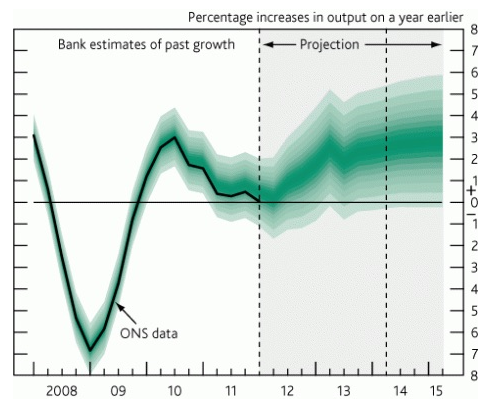
A line chart with a forecast, in which the forecast is an area an not just one line:
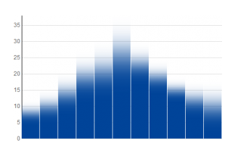
Or this bar chart with a gradient, because the absolute value is uncertain:
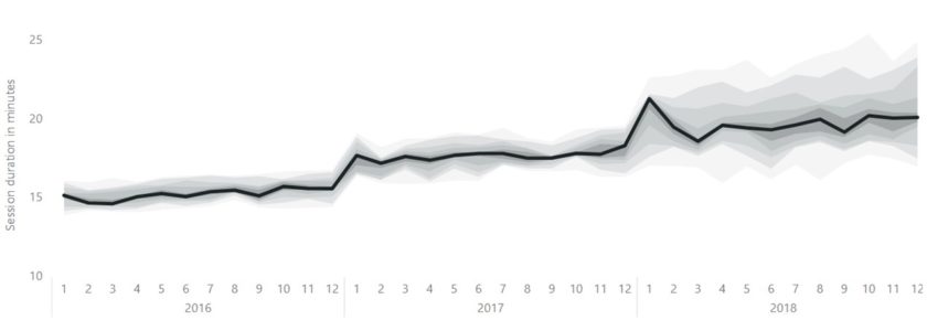
I think the second example with the line chart is an especially good example for me, because I have had to deal with this kind of situation a couple of times before. For example, when I had to show the average of a series of measurements through time. I then just created a line chart with the average without showing the variance. Or in one scenario I used boxplots to show the variance of the measurements for each period. But I could have used an example like above. A chart where the average (or median) of the data is shown as a line, but also showing the spread or variance of the data in a surrounding area. That’s what I wanted to try for this challenge, using Power BI.
Result
I couldn’t really come up with a good public or anonymous data source that matched my train of thought. So I made up my own ficticous case and generated some data in Excel.
Below you see the session duration of a webshop. That is, the duration in minutes that visitors/customers stay on the website. Here you see that the spread of the data is small. This is around 15 minutes in 2016 and in 2017. That means that every customer spends around 15 minutes on the website (what a coincidence, right?!) But in 2018, the spread (and thus the uncertainty) of this measurement is increasing. That may be caused by the new webshop design that was published in January 2018.
What you actualy see here, is a stacked area chart. The spread of the measurements is divided into 10 pieces for every month. Every decile is a measurement in this chart. The first measure (the minimum value) is made invisible by making it a white color. Every measure is the difference between the decile and the previous decile, because this is stacked chart. This results in weird values in the tooltip, so I created a custom tooltip that shows the spread in a boxplot for that month.
I have made this visualization with Power BI. But I think this can also be done with other BI tools like QlikView, Qlik Sense, Tableau or Excel. Most BI tools have a standard out-of-the-box stacked area chart.
It was nice to finally work something out for situations like this. I hope to use it in practice some day soon!
What are your experiences with visualization uncertainty in data? Let us know or email us at info@datadump.nl!
Joost Romijn is BI Consultant at ProAnalytics. He helps organizations with translating data to actionable insights.


