
For the #SWDChallenge of this month I created linked bar charts using Power BI, inspired by an example in QlikView I saw a long time ago.
This post is a submission for the #SWDChallenge of October 2019 and is therefore written in English.
Just as previous month, I also participated in the #SWDChallenge of this month. The assignment for this month was to visualize the data that was presented in a table. A table is common way to summarize or aggregate our data. When we want to communicate our data to an audience however, this “chart” type is not really all that effective. We therefore have to visualize the data in this table in a more user-friendly format in order to get our point across. The given table for the challenge looked as follows:
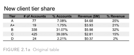
The table presents us with some information about the number of accounts (customers, I guess), categorized by “Tiers” and the corresponding Revenue for these Tiers. It also shows the percentage of the total this Tier represents for either the number of accounts or the revenue. This is tricky though, because these percentages do not add up to 100%. This indicates to me that there are some accounts not categorized in a Tier. I calculated the missing number of accounts and added these in a new Tier called “E (Unlabeled)“.
Example
When looking at this data I wanted to visualize the percentage of accounts and their corresponding percentage of revenue. In order to do that, I needed two charts presenting the piece to a whole (pie charts?!) and a link between them. Thinking about this, I suddenly remembered a chart I saw years ago, made by Bitmetric.
In this post (had to dig through to the archives to find it), they introduce the “Linked bar chart”. Made by two stacked bar charts and an area chart in the middle.
Result
Even though it is stated that this chart does not make much sense, it think it can be applied to my situation for this #SWDChallenge. The preceding example was made with QlikView and I wanted to see if I could create a similar thing using Power BI. My result looks like this:
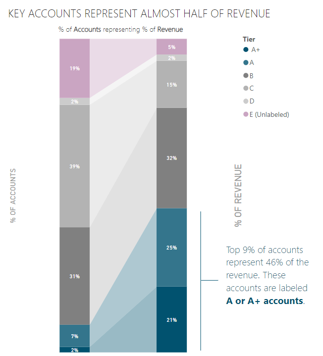
As you can see, it is possible to create a similar result in Power BI. But Power BI does not support a horizontal area chart, so I had to make this a vertical viz. The concept is the same: two stacked bar charts with an area chart in the middle. There is a little overlap of these charts so they nicely fit together. I chose a dark blue color to highlight the “Tiers” that support my key-takeaway. That is that the top 9% represent almost half of the revenue. I chose a different color to highlight the missing/ unlabled category. Power BI came up with purple by default, and I thought it fitted nicely.
I think the “Ribbon Chart” in Power BI does kind of the same thing (I have not used it much yet), but since I have two different measures here, I don’t think that would work in this scenario.
I learned something new again this month. Looking forward to the next challenge!
Wat are your experiences with linked bar charts? Drop a comment or ask us anything via info@datadump.nl!
Joost Romijn is a BI Consultant at ProAnalytics. From this role he helps organizations with translating data to meaningful insights.